Communicating ideas through campaigns, editorial design and corporate communications.
NTU Management Career Fair Recruitment Campaign
Employer Branding • Visual Communication
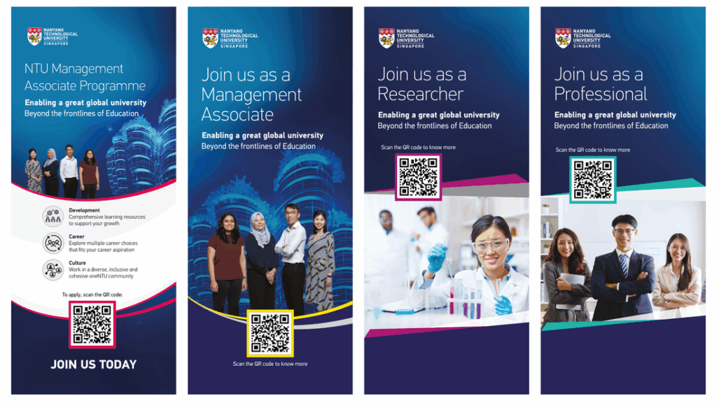
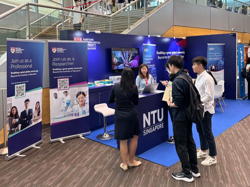
Challenge
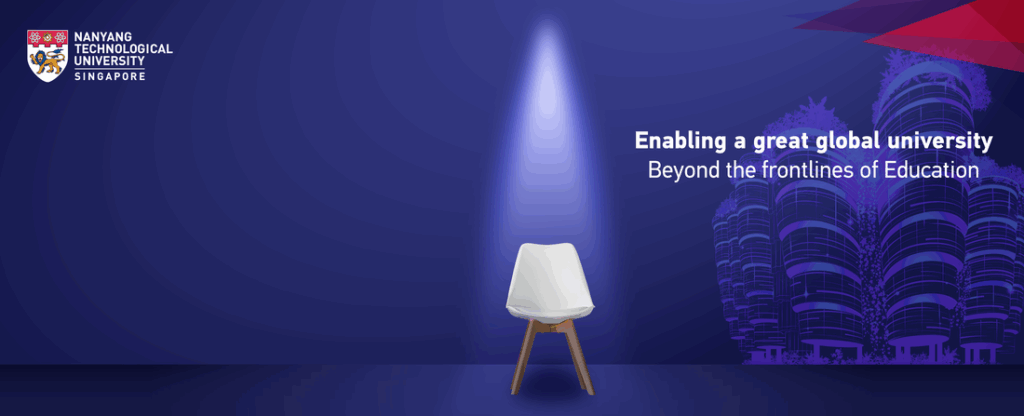
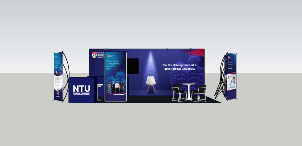
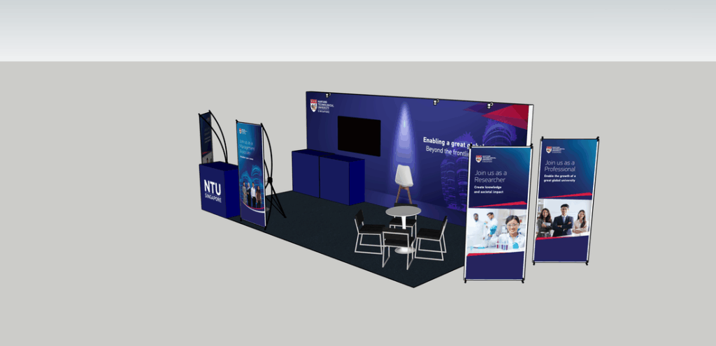
Develop a cohesive recruitment experience for NTU’s career fair that would attract graduates, communicate multiple career pathways, and maintain a strong institutional presence within a competitive exhibition environment.
Approach
Designed an integrated visual communication system spanning exhibition backdrops, standee banners and environmental graphics. Created a consistent visual language that unified the booth while differentiating recruitment streams including Management Associate, Researcher and Professional opportunities through colour accents, imagery and messaging. Produced 3D booth visualisations to validate spatial composition, visitor flow and stakeholder alignment before fabrication.
Impact
Delivered a cohesive recruitment environment that translated NTU’s employer brand into a clear and engaging physical experience, enabling consistent communication across multiple touchpoints from concept through on-site implementation.
ICRAT 2024 – International Conference on Research in Air Transportation
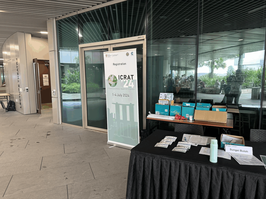
Developed a scalable visual communication system for an international conference, enabling consistent messaging across print and digital touchpoints despite evolving programme requirements.
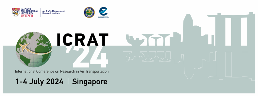
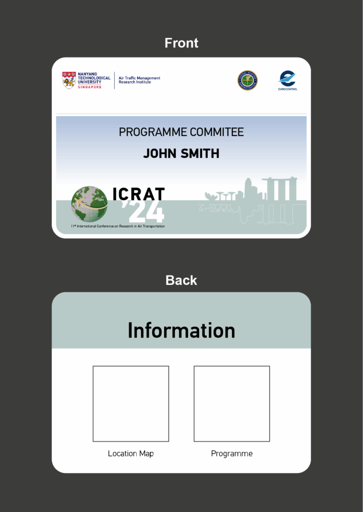
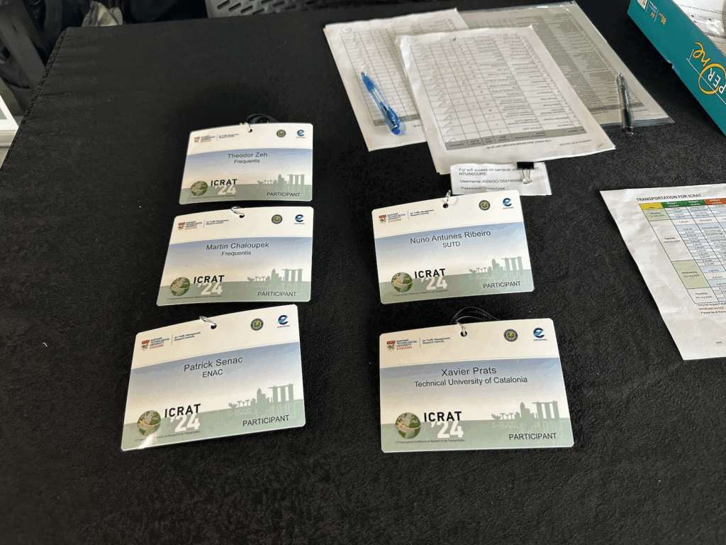
Challenge
Create a cohesive visual communication system for an international research conference involving multiple global partners while supporting a wide range of digital and printed collateral throughout the event lifecycle. The communication assets needed to remain flexible as programme details, attendee information and logistics evolved.
Approach
Established the conference’s visual identity through a clean, contemporary key visual inspired by aviation and Singapore’s skyline. Developed a scalable design system that could be applied consistently across banners, registration materials, delegate badges and digital communications while accommodating frequent content updates without disrupting hierarchy or brand consistency.
Impact
Delivered a unified communication system across both digital and physical touchpoints, providing attendees with a clear and recognisable conference experience from registration through the event itself. The flexible design framework enabled efficient updates throughout planning while ensuring consistency across all collateral.
NTU Managed France–Singapore Merlion Workshop on Artificial Intelligence for Air Traffic Managementment
EDM
Challenge
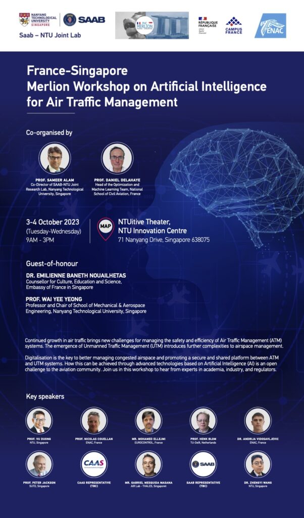
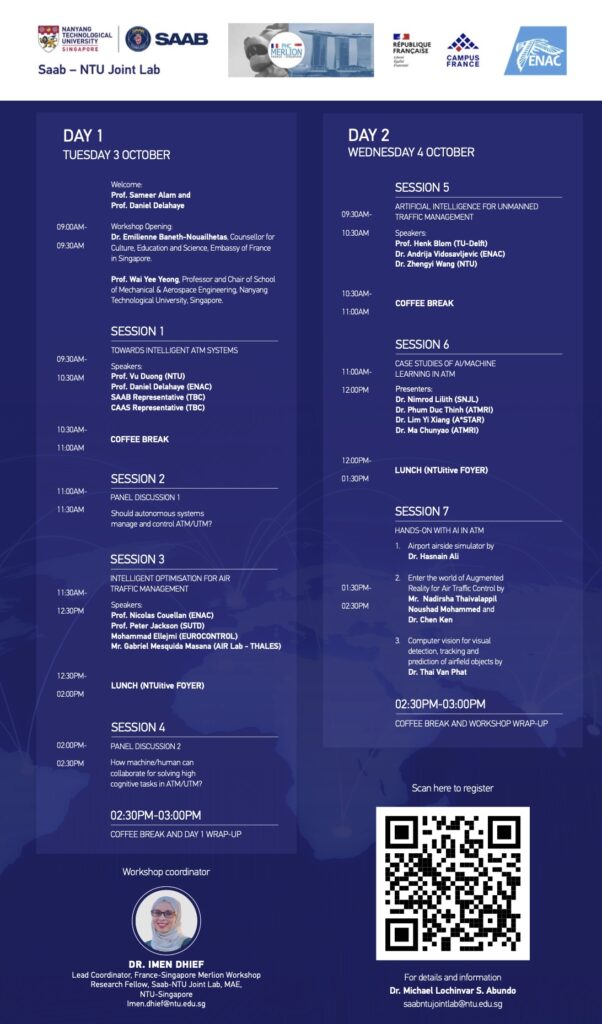
Communicate a technically complex international AI conference involving multiple organisations, evolving content and numerous speakers within a clear and cohesive visual system.
Approach
Developed the event’s visual identity, established key visuals and designed a modular layout framework capable of accommodating frequent programme updates while maintaining information hierarchy and brand consistency.
Impact
Produced a scalable communication system that enabled efficient content updates throughout the event planning cycle while delivering a polished and credible experience for an international audience.
NTULearn Student Onboarding Infographic
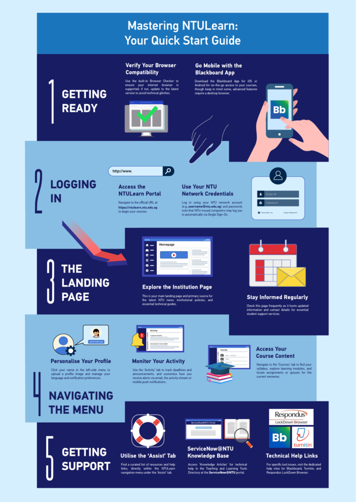
Designed a visual onboarding guide that helps new students quickly familiarise themselves with NTULearn (Blackboard), transforming technical instructions into an engaging infographic aligned with NTU’s brand
Challenge
New students often face a steep learning curve when accessing NTULearn for the first time. To complement an existing onboarding booklet, the Tech Enablement team wanted a concise visual guide that would simplify key tasks and make essential information easier to understand at a glance.
Approach
Refined an initial AI-generated draft into a polished infographic by restructuring the information hierarchy, improving visual flow, and applying NTU’s corporate brand guidelines. Introduced custom illustrations, icons, and a more vibrant visual style to create a friendly, engaging experience suited to a student audience while presenting the onboarding process as a clear step-by-step journey.
Impact
Delivered an easy-to-scan infographic that complemented the onboarding booklet, making key LMS functions more approachable and helping students navigate NTULearn with greater confidence from their first login.
My Contributions
Refined the AI-generated concept into a production-ready infographic. Redesigned the visual hierarchy and information flow. Applied NTU corporate branding and colour palette. Created supporting icons, illustrations and layout. Enhanced readability and engagement for a student audience.
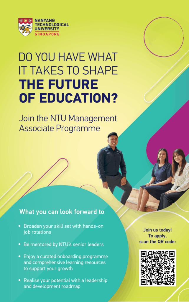
NTU Management Associate Programme, Recruitment Campaign
Employer Branding • Campaign Design
Challenge
Develop a recruitment campaign that resonates with ambitious graduates by balancing strong brand consistency with a fresh, human, and engaging visual language.
Approach
Used NTU’s secondary brand colours to create a fresher, more youthful aesthetic while maintaining brand integrity. Paired dynamic layouts with clear messaging to position the programme as both aspirational and accessible.
Impact
Produced a visually distinctive campaign that successfully balanced corporate credibility with contemporary appeal, helping position the Management Associate Programme as a compelling opportunity for future leaders.
ASEAN+3 Conference Visual Identity
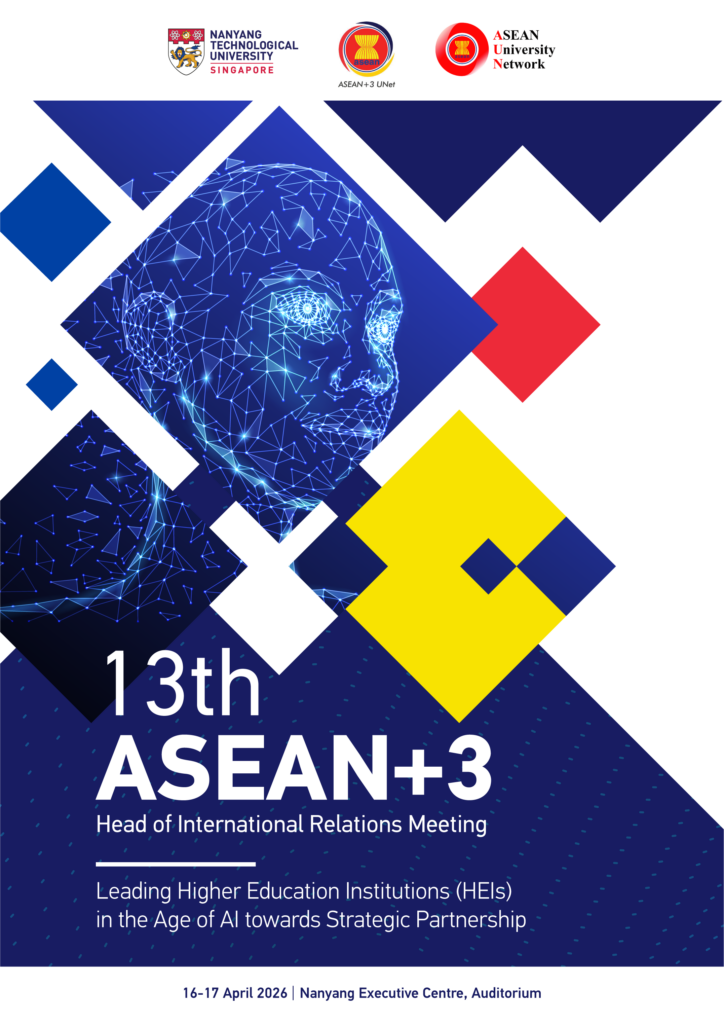
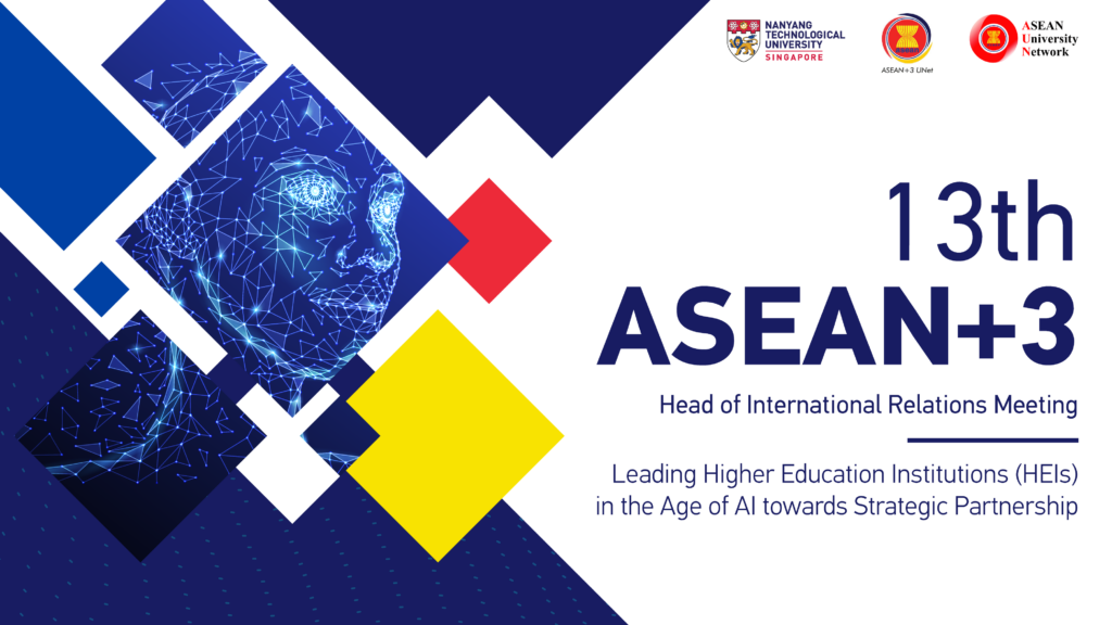
Developed a scalable visual identity for the 13th ASEAN+3 Head of International Relations Meeting, creating a flexible design system that unified event communications across print and digital platforms while reflecting the theme of AI-driven international collaboration.
Challenge
The organising committee required a refreshed visual identity for the 13th ASEAN+3 Head of International Relations Meeting that better represented the conference theme of international collaboration in the age of AI. The design also needed to reflect ASEAN’s regional identity while remaining flexible enough to adapt seamlessly across multiple formats and communication materials.
Approach
Designed a modular key visual inspired by AI, connectivity, and collaboration, combining geometric forms with a digital wireframe illustration and a colour palette influenced by ASEAN. The visual system was intentionally built to be scalable and adaptable, allowing the same design language to be applied consistently across booklet covers, presentation templates, and other event collateral without compromising visual impact.
Impact
Delivered a cohesive event identity that established a recognisable visual presence across print and digital assets. The flexible design system streamlined the production of communication materials while reinforcing the conference theme of innovation, partnership, and regional collaboration.
URECA Programme Publication Design
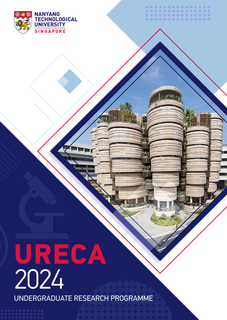
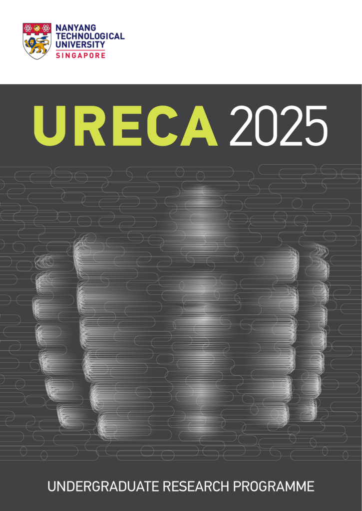
Developed concept-driven cover designs for NTU’s Undergraduate Research Experience on Campus (URECA) publication, exploring multiple visual directions that communicate research, innovation and discovery while establishing a refreshed visual identity.

Challenge
The URECA programme required a new publication cover that moved away from previous visual styles while representing undergraduate research and innovation. With limited creative direction and no photography of student research available, the challenge was to develop a compelling visual concept that reflected the programme’s purpose and aligned with NTU’s brand.
Approach
Explored multiple creative directions based on the brief, each interpreting research and discovery through a different visual language. Concepts ranged from architectural imagery highlighting NTU’s research environment to more abstract graphic representations inspired by experimentation, data and scientific exploration. Each design balanced strong visual impact with clear typography and publication usability while remaining adaptable for future editions.
Impact
Produced three distinct design concepts, providing stakeholders with a range of strategic visual approaches to evaluate. The concepts demonstrated how the URECA programme could be represented through both symbolic and campus-focused imagery, supporting informed design decisions for the publication’s next visual direction.Design Exploration
Concept A — Campus as Innovation
Showcased NTU’s iconic architecture to position the campus itself as a place of research and discovery.
Concept B — Research Environment
Used atmospheric photography and minimal composition to communicate professionalism and academic excellence.
Concept C — Abstract Research
Created a graphic interpretation inspired by data, experimentation and scientific processes to represent innovation without relying on photography.
GoAircon Mobile App Icon
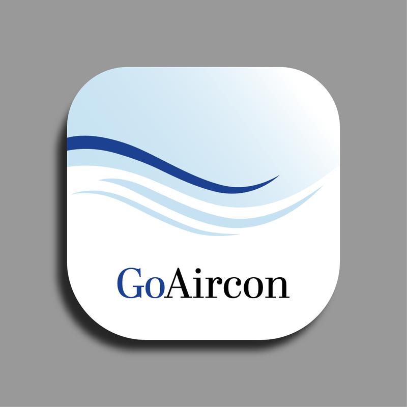
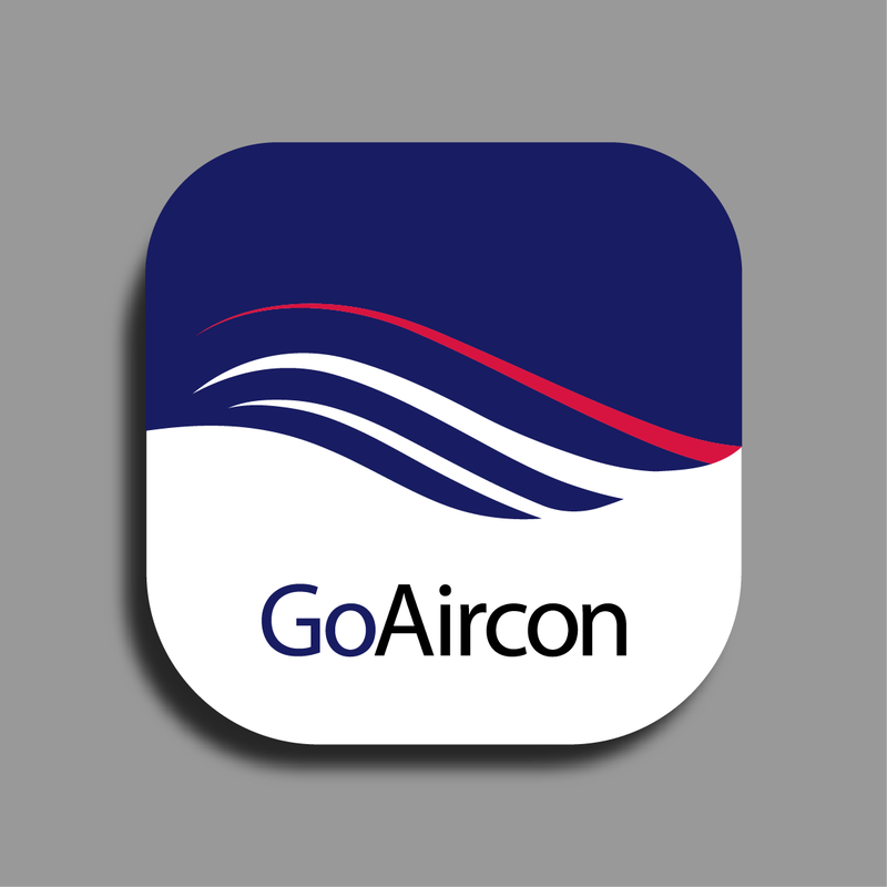
Designed the mobile app icon for GoAircon, translating an open-ended brief into a clean, recognisable visual identity that communicates cooling and airflow through simple, scalable forms.
Challenge
Design a mobile app icon for GoAircon, a campus utility app that allows students residing on campus to top up credits for air-conditioning usage. The brief provided minimal creative direction, requiring the icon to feel clean, professional and instantly communicate the concept of cool air while remaining recognisable at small sizes.
Approach
Explored a visual language centred around flowing air currents, using layered wave forms to suggest cooling and airflow without relying on literal illustrations such as air conditioners or snowflakes. A restrained colour palette of blues and white reinforces freshness and trust, while the simplified composition ensures clarity and legibility across mobile devices. Multiple concepts were developed to balance a corporate aesthetic with an approachable user experience.
Outcome
Produced a clean, scalable app icon that conveys cooling and airflow at a glance while aligning with the university’s digital ecosystem. The final design delivers strong recognisability in a compact format and establishes a distinctive visual identity for the application.